
K-Pop may have started with music, but it's grown a lot from that. It's become a global phenomenon that demands the attention of all your senses.
Alongside new music releases from Korea's top acts, artists and agencies come together to conceptualize the visual aspects of every project they work on. It's a complex process and takes a lot of creative heads to brew up a storm. When the downpour begins, the floodgates open to unveil the next big stunner to rule the charts.
Albums could come as an epic box set disguised as a comic book with photocards describing members as superheroes. They could be as simple as an album with a photobook dressed like a hardcover novel. It could even be packaged like a board game with posters and CDs tucked inside. When it comes to the image of K-Pop, there are no limits. Just boundless creativity that's given the chance to flourish and bring joy to fans worldwide.
We caught up with Korean graphic designer Jiyoon Lee to talk about Studio XXX's projects with Kang Daniel, BTS, LOONA, Taemin, TXT, and Taeyeon, what it's like working with them, and the different creative processes behind her works.
How much creative freedom did you have for each project?
It varies with the circumstances, but I always have the freedom to design in case it fits clients’ needs. The design depends on the mood of the music and visual concepts.
What was the process like working on the project? Does your creative process differ in any way when working on an album compared to a concert?
Here is the most common process. Firstly, the agency decides what the music/visual concept is like and send me the music and brainstorm the visual concept. And then, I come up with multiple proposals of the album logo and the key graphics, and the agency chooses one that they think is the best. Lastly, I put things together and make an album package. The process is complex and requires several professionals working for different parts such as photography, styling, and so on. Graphic design is one part of the process.
Concert posters should explain themselves—the concept and information of the concert by one image—whereas albums are more like merchandise for fans.
What were some of your inspirations for each project?
Kang Daniel - Color On Me

The album I worked on was his first solo album released by his own agency. The agency and I wanted to emphasize his presence as a solo artist, we also wanted the album to look like a special edition from a fashion magazine.
BTS - You Never Walk Alone
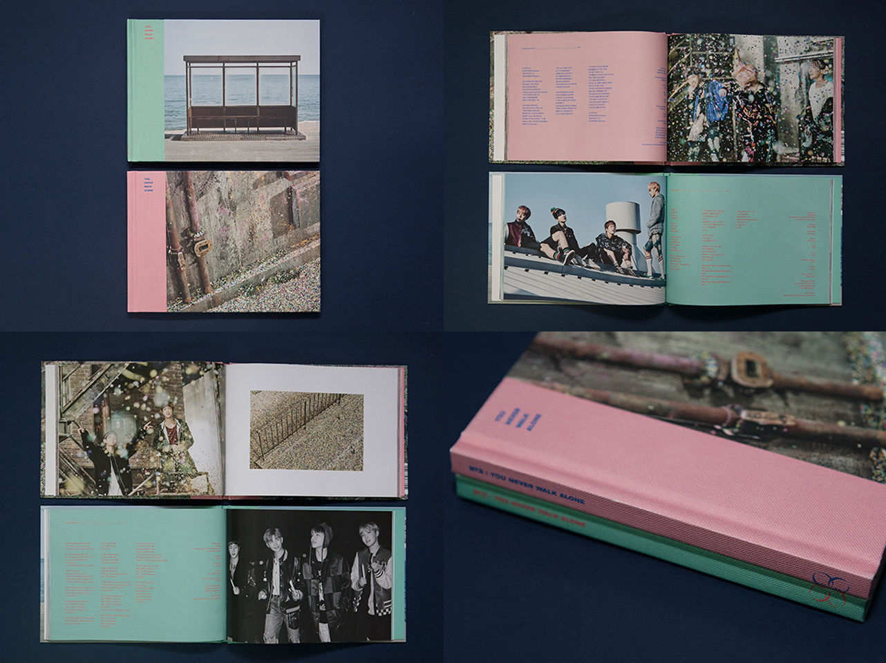
The look and feel of this album is soft and personal compared to the former BTS album WINGS. The title track 'Spring Day' sounds warm and has a hopeful message, and the subject of photography is also about hope and friendship. I designed this album to get along with these moods.
LOONA - The Debut Project

The concept of LOONA’s The Debut Project was to unveil each [one] of the 12 girls every month. It was a huge project and took about two years, so the agency needed its representative identity and consistent physical albums.
Their identity consists of Korean consonants 'ㅇㄷㅇㅅㄴ' whose shapes are converted to their English name ‘LOONA’, and all of their albums have the same layout throughout the project.
Taemin - Off-Sick Concert

The agency needed a simple and modern poster for Taemin’s solo concert. The title off-sick meant "throw away all the sickness", so I crossed out the word "sick". It is a very simple and intuitive direction.
TXT - 'Blue Orangeade’ Lyric Video
It is a lyric music video for TXT's ‘Blue Orangeade’. I designed typography and other graphics matching with music and scenes.
Taeyeon - The Unseen Concert
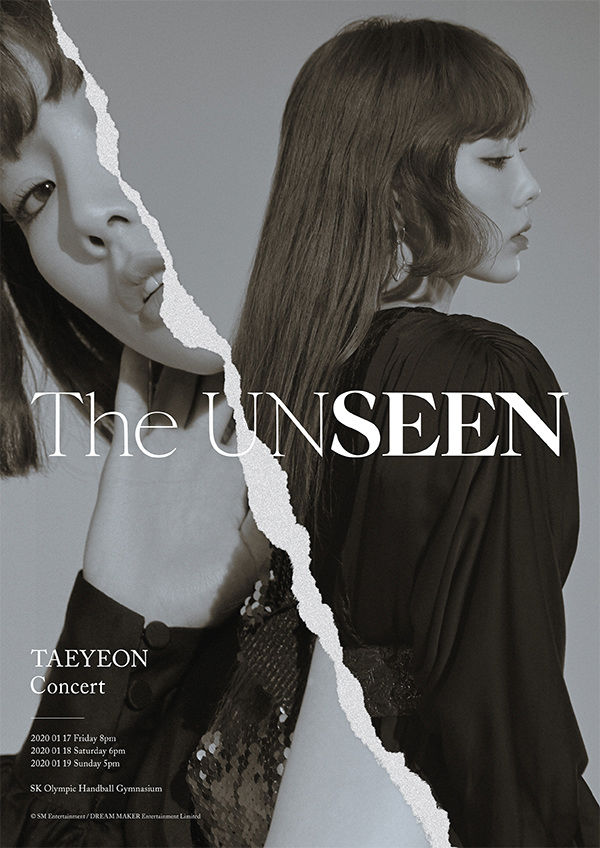
The title, The UNSEEN, was excerpted from the sentence on her PURPOSE album, "NEED TO ALWAYS FOCUS MORE ON THE UNSEEN SIDE OF ME". The agency wanted to show two different sides of Taeyeon which can be seen outside or hidden inside of her mind. I used ripped paper texture to express the sensitiveness of the subject.
What were some of the highlights and challenges working on each piece?
All artists listed above are very popular and have many enthusiastic fans worldwide, so all projects should be done creatively and carefully.
How does it feel seeing your work being enjoyed by fans all over the world?
It is rewarding, but sometimes overwhelming. The more K-Pop gets popular, the more pressure I feel. But it is a happy pressure.
This is part 1 of Bandwagon's feature about Jiyoon Lee and Studio XXX. Check back in soon for Part 2, where we talk about Jiyoon's journey as a graphic designer in the K-Pop industry.
Like what you read? Show our writer some love!
2