
Many aspiring visual artists hope to work with their favorite bands, but not a lot know exactly where to start. In the case of creative director Nicolai Maybituin, he literally started at the start.
Back when Ben&Ben had their 2016 debut EP in the works, Nicolai was part of the then-twin-duo's management group Sindikato. Their connection led to Nicolai later on creating the cover art for their singles 'Branches' and 'Ours.'
Bandwagon Doodles: Ben&Ben members tell their stories through their instruments and interests
"Last January, me and the [Guico] twins met up to talk about the album. I was expecting a simple brief about making the cover art for it but by the end of the meeting, I was appointed as the creative director," Nicolai tells Bandwagon of his experience. "All we had back then as material were demos of the songs, so design-wise, there was a lot of ground to cover. It was my first time to helm a project in this role, but nonetheless I did my best, and hopefully, it reflects in the album's packaging, the illustrations, marketing, and the upcoming tour."

The process in visualizing their debut album Limasawa Street happened smoothly, Nicolai, who primarily practices digital painting and 3D, reveals.
"'Mitsa' was the first thing I worked on since it was set to be released as a single in a few weeks. Next came the album's packaging. Me, Toni, Keifer, and sir Datu Arellano initially worked on the mechanics of the design and how it'll set itself apart." Together, they took inspiration from wine boxes and K-Pop albums to develop their vision to release something more than just the usual jewel CD case: a lamp.

Bandwagon caught up with Nicolai Maybituin to give his personal track-by-track guide to Ben&Ben's debut album Limasawa Street.
LIMASAWA STREET

The second song I worked on and took the longest, probably 60 to 80 hours from conceptualizing to final, spread out across two weeks. The main challenge with 'Limasawa Street' was how I was supposed to capture: 1) the song itself, being fast and having a lot fantasy in its imagery (time standing on bare feet, horses driving, maybe a Bojack reference? I'm not sure, I haven't asked them, haha) and 2) making sure whatever I illustrated will also represent the album in its entirety, which made sense once we realized that the packaging itself could be incorporated into the artwork. Kind of meta, sure, but it worked for us!
The tiny details in the artwork are very important, as we all felt they should tie together in offering a glimpse into the world the song represented. The process I did in creating the artwork is as follows: I started modeling the composition in 3D to make sure the scale and perspective was accurate, then rendered the image, painted over it in black and white in Photoshop, trying to not go too wild with the textures. I was very nervous when I finished the black and white phase, as it felt very lackluster.
Then I decided to experiment by adding only a gradient map for color. Then it clicked. The entire image is made up of only shades of black, white, blue, and yellow. It was all it needed.
PAGTINGIN

The last song I worked on, as it was added to the album late into the process. 'Pagtingin,' to me, is a song that brings you back to the first time you told someone you liked them. Is it cheesy? Sure, but did it happen? Probably, depends.
I wanted to take the context of the song into the present, so I added my own interpretations of the contemporary, also as an excuse to avoid drawing faces. The small details in the artwork reflect that. I also want to give a shout-out to Sai (@pandesaii), Gray (@graydanao), and Liyan (@liyantamares) for giving me a lot of input when I was stuck with this piece!
FALL

One of my favorite pieces to make because I am absolutely enthralled with clouds. When I listened to the song, it kind of made me feel... floaty? I don't know what other word to use, but it you'll know it when you listen to it.
The artwork was initially a singular frame of clouds against a sky backdrop, but I felt like giving it a progression in a sense, from morning to nighttime, made more sense for the song, since that's how falling in love feels like most of the time, I think? I studied a lot of references with how clouds look like at a specific time, for accuracy. But also I just really love painting clouds.
TALAARAWAN

The third song I worked on! I remember being torn when I was making this piece, pondering whether I should keep the style consistent or allow myself to let loose, as I have recently unsubscribed to the concept of having a "style". In the end I followed my gut and allowed the songs themselves dictate how they should look like.
For this one in particular, I struggled a lot with the initial composition, as I neither had lyrics nor a demo of the song. All I had to work with was the title and the brief "longing for yesterday", so I went in with this piece more or less blind. I ended up referring to my personal experience when I made this.
I was never the type of person to keep a journal, so I felt the image of thousands of pages being lost, asking a lot of what if's, and going through regret were key concepts to jump off from. Shout out to Lianne Adarne (@lianneadarne) and Lianne Tamares (@liyantamares) for helping me out in deciding the final color tones for this piece!
HUMMINGBIRD

Probably the piece that bugs me until now, as I'm still undecided whether I like the background blue or yellow. But I can't do anything at this point anymore, so that's a personal lesson in moving on for me. And speaking of moving on, I think the core of 'Hummingbird' is about that, or at least, the inability to do that. The feeling of something or someone from the past still looming over you.
The subject you see in the piece is trying to take off or "shed" the foliage (the looming feeling), while a hummingbird (the thing from the past) flutters next to it. I feel weird explaining it, haha. It was a challenge for me from a technical standpoint, as I absolutely suck in anatomy but I wanted to draw a more or less accurate torso, so that took the longest time when I worked on this!
MITSA (SALAMAT)

I made the artwork for 'Mitsa' the same week we initially met for the album. It was very timely when I first heard it.
'Mitsa' is relatively the most literal in terms of how I envisioned and executed it. It was really fun to make the glowing effect for the fire and the tiny tiny details in the wax.
If there are any artists familiar with the color dodge glow technique in Photoshop, y'all feel me with this one.
BAKA SAKALI
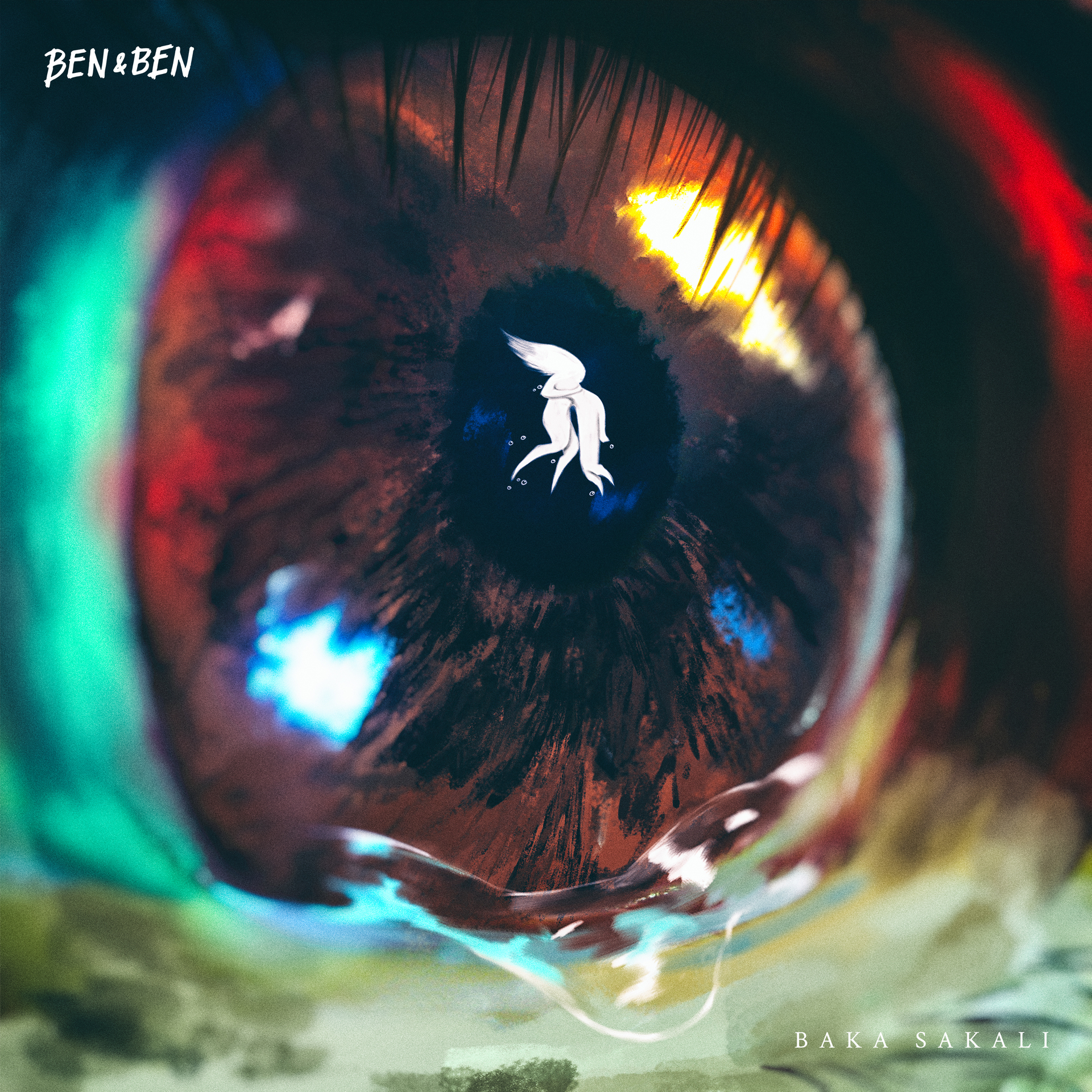
There are two versions of the artwork for 'Baka Sakali.' The first one was really horrible and I feel like it's detached from the song. The second one is my favorite thing in the world and I would treat it like my own child if I could.
'Baka Sakali' is a song I first heard way back in 2017, back then I only knew it as "soundcheck song" and was always curious when the band was going to record it. The first version of the artwork was made without any knowledge of how the album version sounded like, I only had lyrics and fond memories of past soundchecks.
I was actually done with all the artwork before I remade 'Baka Sakali.' When I heard the album version, with its somber buildup juxtaposed with a thundering finale, I came to realize that I didn't do it enough justice. So I made almost everything from scratch, retaining only a small element from the first version.
The song, to me, sounded like a plea for a lost cause, which lent a lot to what we see in the final art, and I wanted to incorporate more lively colors to reflect the popping instrumentation of the song better.
LUCENA
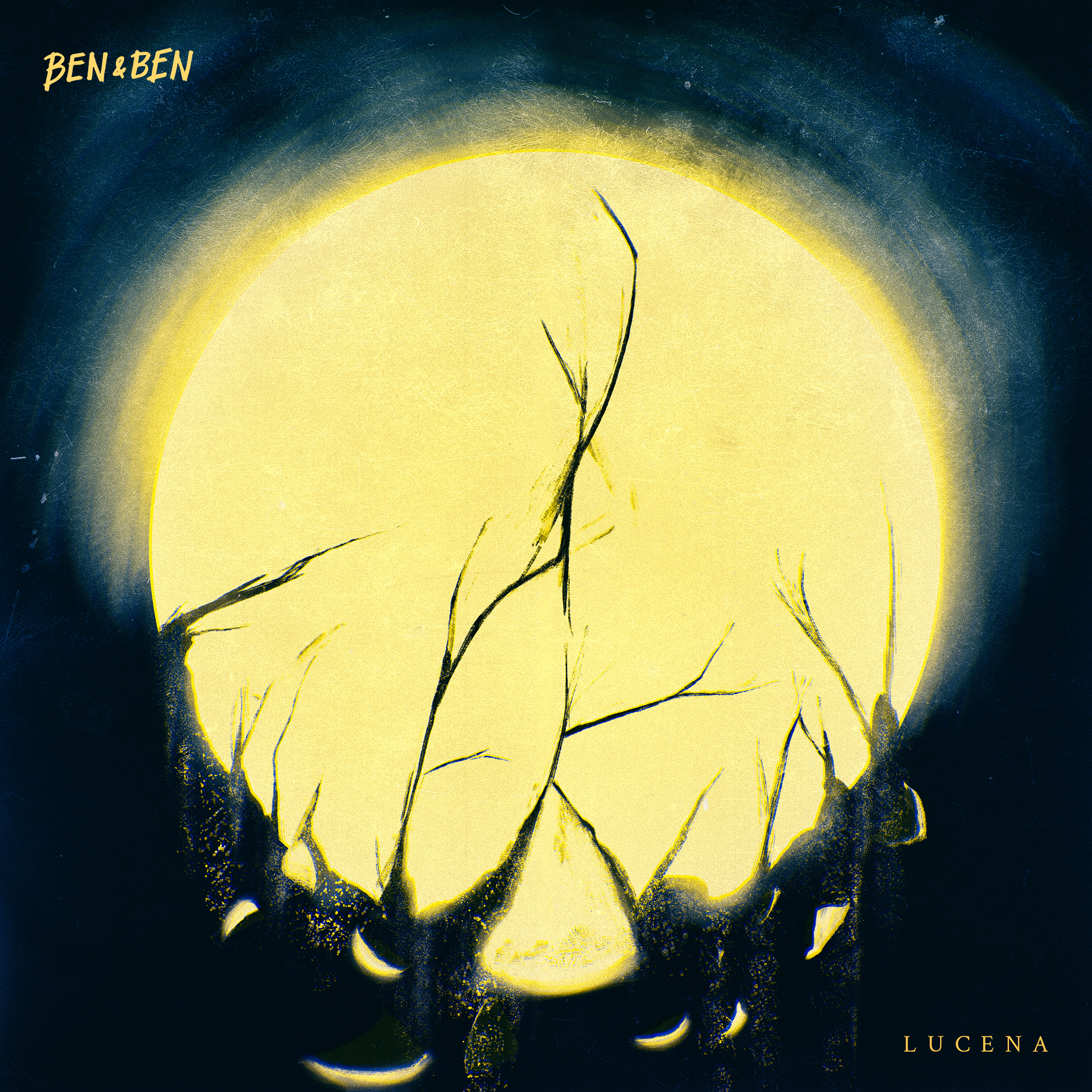
Similar to 'Baka Sakali,' this one had two versions as well, but the difference was that 'Lucena' had a totally different concept in terms of visuals.
The song is flowing, fast, and very loud. The scene that kept popping out in my head was a long night drive across a highway, which was absolutely not what I painted. But I wanted to turn the feeling of that scene into something visual, which is what I painted.
I based the design on spherical bulbs sometimes seen on street lamps. The collapsing sphere, to me, echoes a release, an escape.
SAMPAGUITA

'Sampaguita' was a difficult song to create something visual for, since the topics it deals with are all too real.
At the time I was painting this, admittedly I did not have any form of social investigation and class analysis yet nor any in-depth education on the socio-political landscape of the country. Now that I do, I hope I can better represent the masses in my future work since they are the audience.
Now, going back, 'Sampaguita,' as I took it, is a song that echoes the everyday suffering of the poor and how their lives are in danger for merely existing. I used the image of a person draped in our flag as the subject, I wanted that to represent the victims of an unnecessarily cruel system. My only regret in this piece is that I wish I could've shown their struggle better.
WAR

'War' is a song of growth and learning from the past.
There's a lot of symbolism involved in this piece. Keifer, the band's violinist and writer of this song, guided me a lot and gave lots of input as this song is personal for him. It was a collaborative effort between me and him.
I don't want to explain the meanings behind the elements in this piece and would rather leave that to the audience. It was fun for me to use very simple strokes and add tons of effects after, the "rainbow" in the artwork was especially fun!
GODSENT

This piece was the only one where I used 3D instead of digitally painting it. There was a lot of introspection in my part, repeatedly asking myself if I should break away from the process that I usually do when creating artwork for Ben&Ben specifically. Once again, I decided to trust my gut and follow what I think the song needed.
The song gave me a more matriarchal feeling instead of spousal, so I used the Madonna and Child image in order to convey said feeling.
ROOTS

'Roots' is a love song through and through for me. It uses a lot of imagery of, well, roots. 'Roots' are a foundation, foundations of a tree.
I know there's a lot of buzz around the band using parts of trees as song titles and there's really no denying it, and there's nothing really wrong with it. The song is very light and easy to listen to. I wanted to avoid painting an entire tree, as I was afraid it might end up looking a lot like the artwork for 'Branches' and 'Ours,' and instead painted to imply one instead.
ARAW-ARAW

With 'Araw-Araw,' I wanted to portray a relationship between people that doesn't necessarily just represent what we've known to be the norm. That is, strictly between a man and a woman, which is why I purposely painted the figures here androgynous.
Many thanks to Lianne Adarne (@lianneadarne) and Roch Lazarte (@frnnyglss) for giving their input when I made this. I hope that with this image anyone can identify with any of the two figures, as I openly support LGBTQ+ relationships. It's important for all of us to use whatever platform or avenue we have to support those being oppressed. Be it the LGBTQ+, working class, peasant class, etc.
Stream the new album here:
Physical copies of Limasawa Street will be available at booths near the concierge from May 10 to 12 at the following Ayala Malls: Abreeza, Alabang Town Center, Ayala Center Cebu, Ayala Malls Legaspi, MarQuee Mall, Solenad, and Trinoma. Limasawa Street is now available via their official Shopee store.
Don't miss the band's nationwide album tour which kicks off on May 17 at Marquee Mall in Pampanga. Ben&Ben are also set to return to Singapore with a performance at 1MX Singapore on May 26.
Like what you read? Show our writer some love!
1